student project
Project
Wayfinding
Challenge
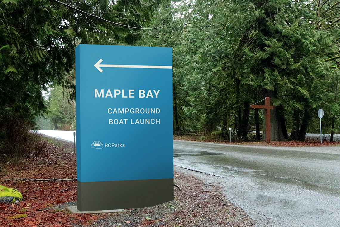
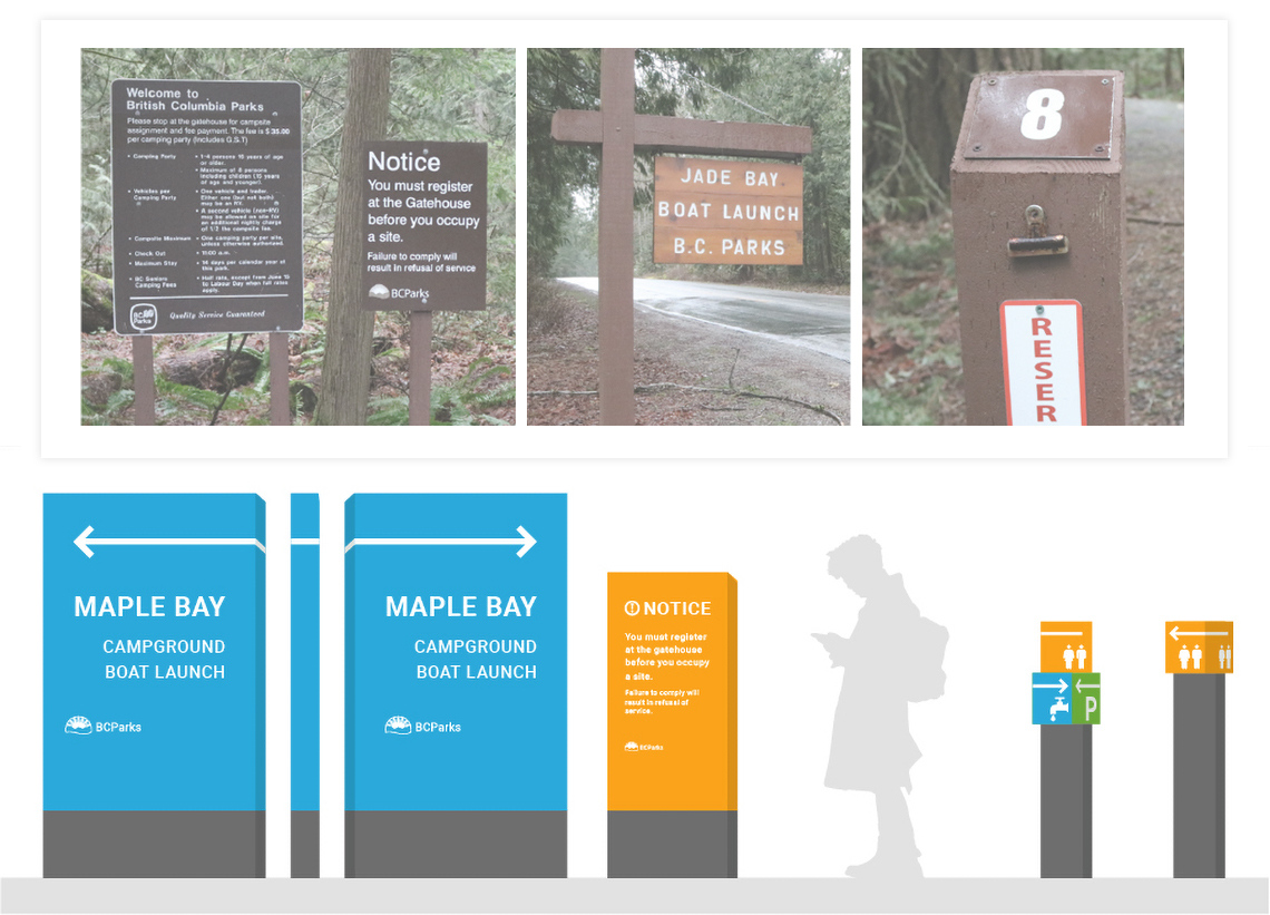
Create high visibility wayfinding solution that improves direction and visibility against lush nature. Current signage blends in with the hues of the ground and trees, can be hard to read (for purposes of navigating), and angled campsite numbers are too short and are often backed into and are prone to roosting of birds—excrement blurs sign text and requires regular maintenance.
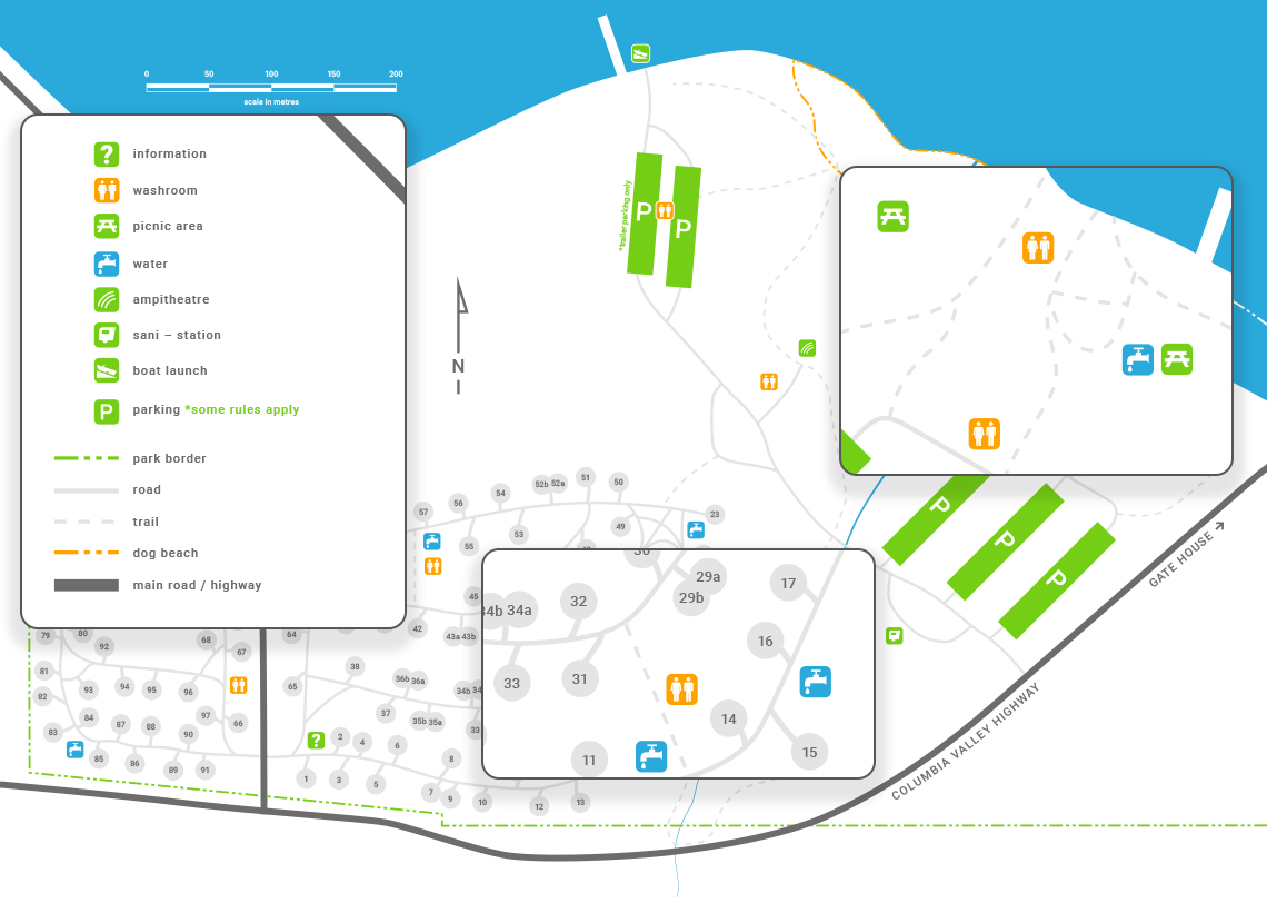
Target audiences are young families, tourists, and trail enthusiasts.
Solution
With the use of bright, friendly colours and digitally engineered font styles, visibility against BC's nature is vastly improved. The use of rotating blocks for multi-directional navigation reduce confusing directions and give parks the ability to point in any direction instead of 8 standard arrows. Lastly, the flat or downward angled faces of the signage prevent birds from defacing legibility.
In addition: